FAQs
See how to use DataVisualizer.ai to generate stunning charts in seconds and avoid wasting hours in Excel and other spreadsheets.
Contents
How it works
Basically, unlike many competitors, the workflow is incredibly simple yet capable of handling complex data and charts. Once you have copied your data or drag and dropped your data file, you can choose
- what type of graph you want (or if you want to have one suggested)
- what the graph should show, i.e. graph title (or if you want to get a preview)
Once selected, the AI will generate a graph based on your data and choices. You can then save the graph (online and with all interactions such as tooltips) or export as an image.
You can include instructions to AI in your chart title to specify what the chart should show, e.g. ""
Supported data
You can drag and drop all common Excel and spreadsheet file types and all (non-proprietary) text file types, e.g. .txt, .md, .csv. Of course, you can also copy the content into the main text field yourself. The only important thing is that the data is formatted as rows of data, i.e. as CSV (which is also by far the most common). You can see some examples under “Chart examples”.
Video
See how to generate charts in seconds:
See full video: WEBM format or MP4 format.
Chart examples
Here are a few selected charts that DataVisualizer.ai has generated in seconds. Their data is taken from Kaggle and they are available as shortcuts under the main text field, e.g. Nobel laureates, Retail sales, Nvidia stocks. Click on the different links to see exact charts for the different datasets.
It is also possible to have DataVisualizer.ai suggest both the chart type and what the chart should depict. You can do this by clicking the “Suggest” question mark and then the “Suggest chart” button. This can be a helpful way find useful charts for your data.
Dataset: Nobel laureates
- Age at Nobel Prize Award by Year and Gender (Bar chart)
- Nobel Prize Winners by Country and Gender (Bar chart)
- Nobel Prize Winners by Decade (Funnel chart)
- Top 5 Nobel Prize Winners by Country (Pie chart)
- Stacked chart showing men vs female per decade (Stacked bar chart)
Dataset: Retail sales
- Net Quantity and Total Net Sales by Product Type (Bar chart)
- Total sales revenue per product (Treemap)
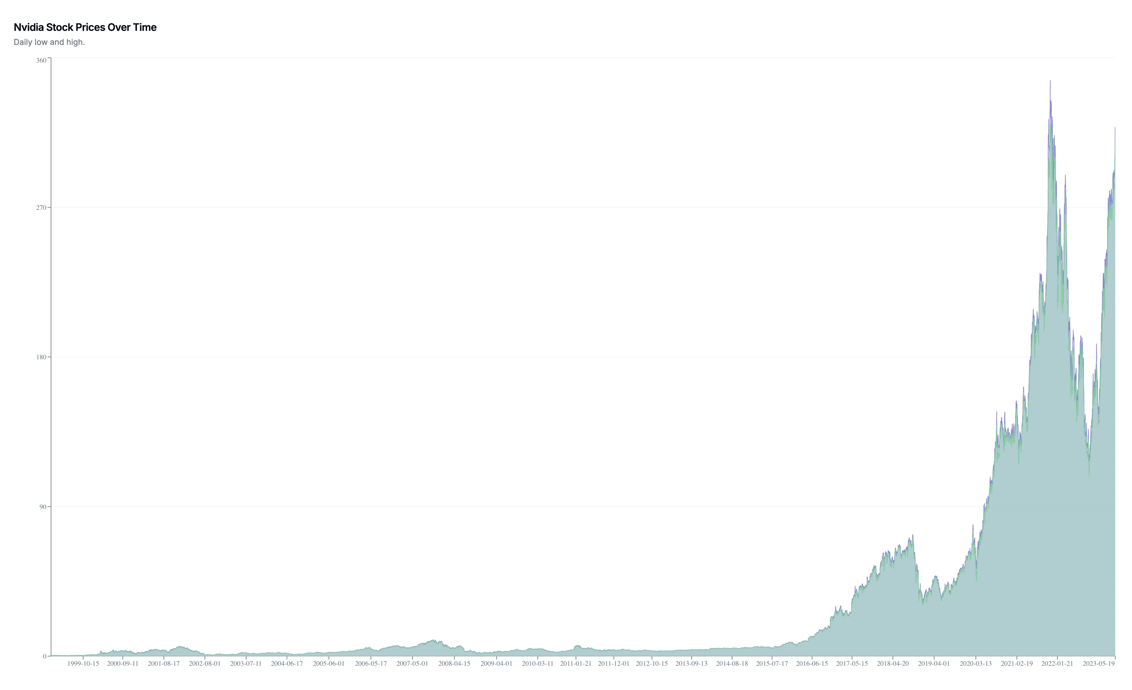
Dataset: Nvidia stocks
- Stock Price Movements Over Time (Area chart)
- Stock Price Movement Over Time (logarithmic scale) (Area chart)
- Stock Price Movements Over Time (Line chart)
- Low vs high comparison (Line chart)
Of course, this is only a limited display of what charts are possible to generate.
Use cases
In today's data-driven world, the ability to visualize and present data in an easily understandable manner is crucial across numerous industries and professions. DataVisualizer.ai addresses this need, saving valuable time and reducing the complexity associated with traditional data visualization tools. By leveraging AI, our platform simplifies the process, making data visualization more efficient and accessible.
Key user groups include:
- Business Professionals
- Data Analysts
- Academic Institutions
- Entrepreneurs and Startups
- Marketing Teams
- Financial Experts
- Healthcare Providers
- Government and Non-Profit Organizations
Essential use cases:
- Visualizing sales data for trend and pattern identification
- Crafting compelling charts and dashboards for investor presentations
- Analyzing customer behavior to inform marketing strategies
- Simplifying complex financial reports for stakeholder meetings
- Enhancing academic research with impactful visualizations
- Monitoring real-time operational metrics in healthcare settings
- Streamlining government data for public reporting and decision-making
- Improving project management with visual progress tracking
- Assessing market research data to guide product development
With DataVisualizer.ai, the possibilities are endless. Tailor your data visualization needs to fit any professional scenario and drive impactful decisions with ease.
FAQ
Social media
If you like to stay up to date on the latest developments, you are welcome to follow us on:
Contact
You are welcome to reach out to us if you have questions or suggestions.
Partnership
Help spread the message by joining the generous affiliate program. You get 30% commission on purchase and 45 day cookie length. Affiliate link are directly to DataVisualizer.ai.
You are welcome to use the video: WEBM format or MP4 format. And app image and chart image.